My Portfolio
Overview
A portfolio is one of the best ways to show what you make, no matter what field you're in. For mine, I wanted to build something that felt more like me instead of just making a normal website with a navbar, some cards, and a contact button.
Since I use the terminal a lot, especially Ghostty, I decided to make my portfolio feel like a terminal. I thought it would be way more fun if people could actually type commands and explore the site instead of just scrolling through everything.
I also wanted the site to reflect how I usually build stuff: random ideas, experiments, projects that start small and then become bigger, and a lot of tinkering. A terminal-style portfolio felt like a good way to show that to the world.
Why I Made It a Terminal
I spend a lot of time using terminal tools (like every developer), so making my portfolio website into a terminal felt natural. Terminals are simple, fast, and customizable, but they can still have a lot of personality depending on the theme, prompt, and setup.
That was basically what I wanted for my site.
I didn't want it to feel like a random template. I wanted it to feel like something I would actually use. So instead of making a normal portfolio, I made one where the visitor can type commands, view sections, switch styles, and mess around with it a little.
It's still a portfolio, but it also feels like a small project by itself.
How I Built It
I originally built the site manually in TypeScript. The first version was pretty simple, but it helped me figure out the basic command system, layout, and terminal behavior.
After that, I improved it with Replit Agent. That helped me test ideas faster and clean up parts of the site without having to manually do every tiny thing. It was useful for turning random ideas into actual features more quickly.
More recently, I also worked on it with OMP. I like trying new tools, especially when they make building projects feel faster or more interesting, so using OMP was another part of the experiment.
The site has gone through a few versions now. It started as a basic terminal-style portfolio, then became more interactive, and now it has a blog too.
Design Inspiration
The UI was inspired by the new Google Gemini app and its "Neural Expressive" style that Google just announced. I thought the design looked really cool because it feels modern and colorful without being too much, so I made it the default style right away.
I wanted to bring some of that energy into my own site, but still keep the terminal feel. So the goal was basically:
- terminal vibes
- clean layout
- cool colors
- not boring
- not overdesigned
I wanted it to feel interactive and interesting enough that people would lose track of time while playing with it.
The style Command
My favorite feature I added is the style command.
Since terminal themes are one of the best parts of customizing a terminal, I thought it would be cool if visitors could switch the style of the site too. The style command lets people change the look of the terminal interface and try different themes.
This makes the site feel more personal and gives me room to keep adding new styles later.
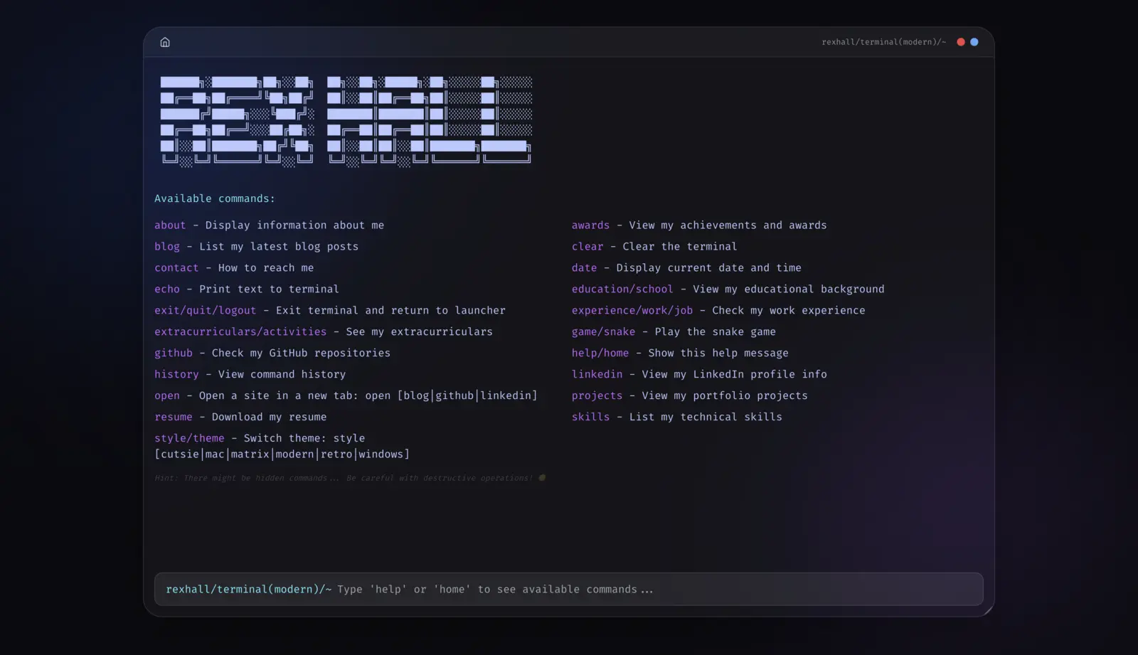
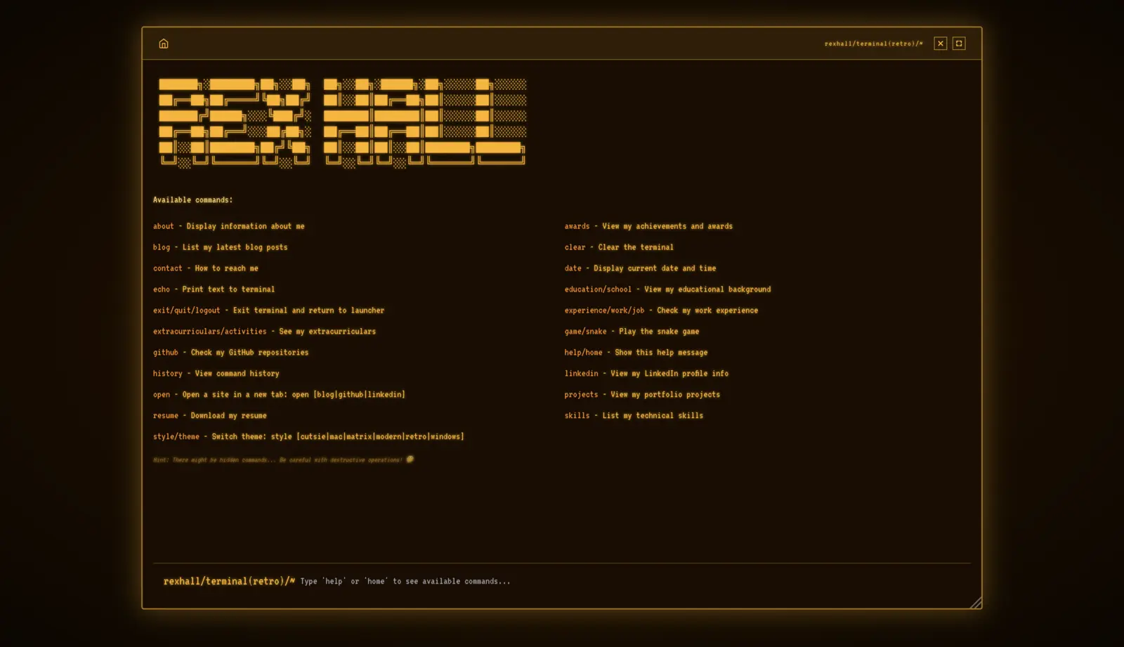
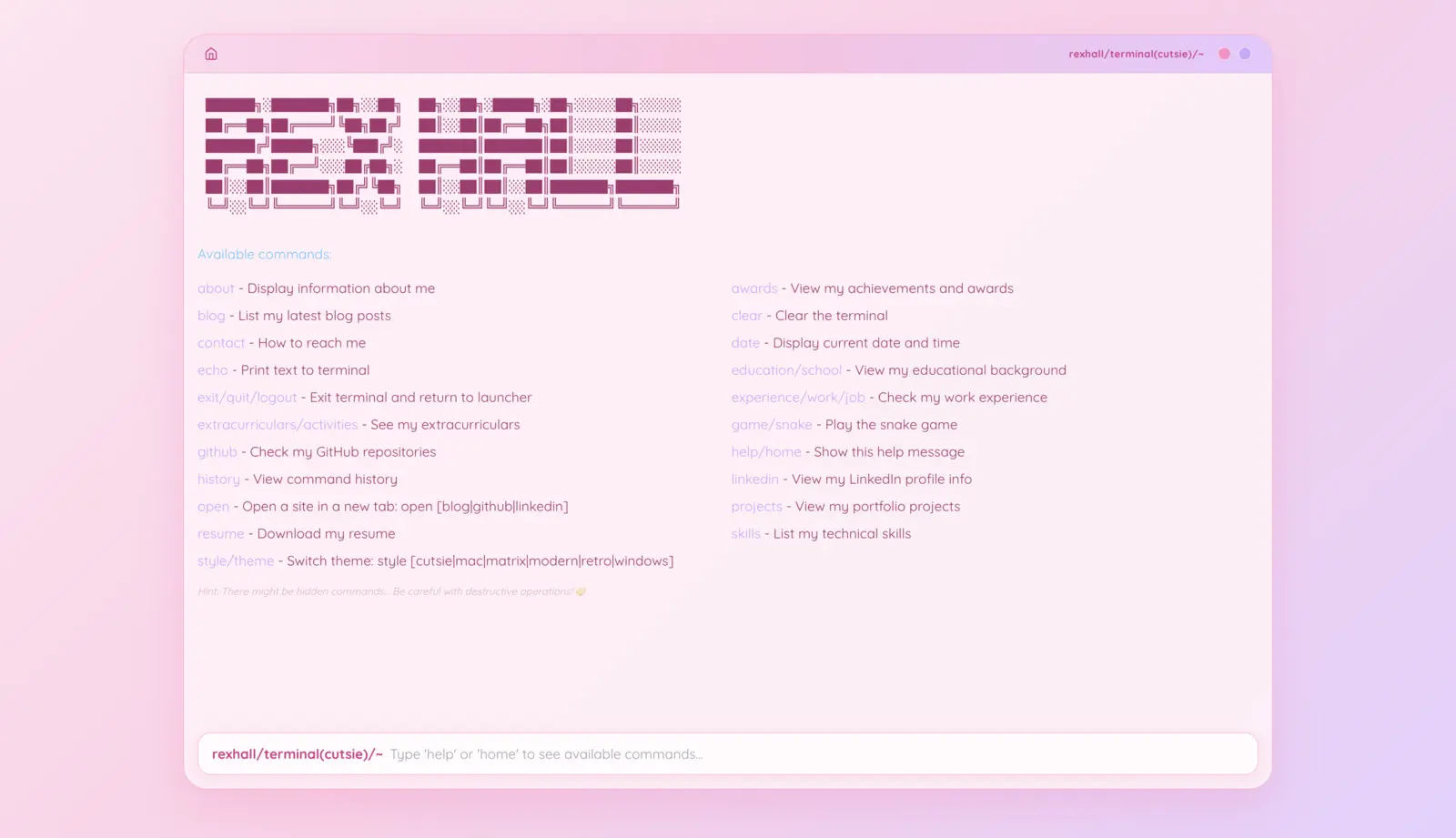
Preview of a few terminal styles. Email me if you have ideas for more :D